Staq Whitelabel – Creating modular financial products for growth
2024 · Lead Product Designer · Whilst at Grotesk
If you'd like to know more please get in contact

Context
Staq saw an opportunity to offer their clients various digital finincial services—a move driven by growing demand and the potential for new revenue streams. The idea was to create a whitelabel product that could be quickly customised and rolled out to future clients for the ability to select any number of services within that they desired. As Product Designer at Grotesk, I was brought in to make sure the design could flex to different brands and feature requests, all while staying easy to maintain and scale.
Context
When Staq decided to launch a mobile banking app for its clients, the goal was clear: create a whitelabel platform that could be easily customized and scaled as new clients came on board. As the product designer at Grotesk, I was tasked with building a system that could handle diverse branding and feature needs—without sacrificing maintainability or speed.
Context
Staq saw an opportunity to offer their clients various digital finincial services—a move driven by growing demand and the potential for new revenue streams. The idea was to create a whitelabel product that could be quickly customised and rolled out to future clients for the ability to select any number of services within that they desired. As Product Designer at Grotesk, I was brought in to make sure the design could flex to different brands and feature requests, all while staying easy to maintain and scale.
Visit www.staq.io
The problem
The biggest challenge? Designing a platform flexible enough to handle a wide range of branding and feature requests from multiple clients, without creating a maintenance nightmare. Each client would need their own look, feel, and sometimes even unique functionality, so the system had to be robust but also adaptable.
The solution
By building a strong design system alongside early prototypes, we made it easy to customize, scale, and maintain the app as and when new clients came on board. This approach set the foundation for a product that could grow and evolve as the client base expanded.
The solution
By building a strong design system alongside early prototypes, we made it easy to customize, scale, and maintain the app as and when new clients came on board. This approach set the foundation for a product that could grow and evolve as the client base expanded.
The solution
By building a strong design system alongside early prototypes, we made it easy to customize, scale, and maintain the app as and when new clients came on board. This approach set the foundation for a product that could grow and evolve as the client base expanded.

Into the detail
It was estential to keep the build of any element within the design system consistant. To help establish the base of the design system to theme we started by using Staq's branding and any established UI colours and standards already in place.
Into the detail
It was estential to keep the build of any element within the design system consistant. To help establish the base of the design system to theme we started by using Staq's branding and any established UI colours and standards already in place.
Into the detail
It was estential to keep the build of any element within the design system consistant. To help establish the base of the design system to theme we started by using Staq's branding and any established UI colours and standards already in place.

File structure – Started out with a base set of core components, published and then bought into the template file, this allowed for easy adjustments and multi layer customerisations for each client file.
File structure – Started out with a base set of core components, published and then bought into the template file, this allowed for easy adjustments and multi layer customerisations for each client file.
File structure – Started out with a base set of core components, published and then bought into the template file, this allowed for easy adjustments and multi layer customerisations for each client file.
The client had specific feature request from the start so to understand these features we began by exploring what competitors had done, such as Monzo, Wise, Cashapp to name a few, this helped establishing best practises, from there I then mapped out flows in itteration to establish a network of features that could sit together whilst also working alone.
The client had specific feature request from the start so to understand these features we began by exploring what competitors had done, such as Monzo, Wise, Cashapp to name a few, this helped establishing best practises, from there I then mapped out flows in itteration to establish a network of features that could sit together whilst also working alone. I will in the future make a case study on the work that went into the flows, it was a big undertaking in its own right.
The client had specific feature request from the start so to understand these features we began by exploring what competitors had done, such as Monzo, Wise, Cashapp to name a few, this helped establishing best practises, from there I then mapped out flows in itteration to establish a network of features that could sit together whilst also working alone.


Alot of work went into discovering a solution for each feature so that each feature could work independantly and together as a whole depending on the needs of any customer
Alot of work went into discovering a solution for each feature so that each feature could work independantly and together as a whole depending on the needs of any customer
Alot of work went into discovering a solution for each feature so that each feature could work independantly and together as a whole depending on the needs of any customer
With the file structure in place, I set up a framework for building design tokens, knowing this would make theming the app fast and flexible. We wanted to be able to swap out colors and fonts easily to match any client’s brand. For all tokens, colour, scale and sizing and typography, I set up primitive tokens then bought them into semantic tokens. I set up some paramtiers to create consistant the primiative colour palate which to start where built with ColorBox. ColoBox allowed for a even selection of tints and shades with the flexibility to tweak. From there the primaitives could then bought into the semantic tokens, this helped quick implementation of brand or custom colours at the primitive level, with only minor tweaks needed for semantic tokens.
With the file structure in place, I set up a framework for building design tokens, knowing this would make theming the app fast and flexible. We wanted to be able to swap out colors and fonts easily to match any client’s brand. For all tokens, colour, scale and sizing and typography, I set up primitive tokens then bought them into semantic tokens. I set up some paramtiers to create consistant the primiative colour palate which to start where built with ColorBox. ColoBox allowed for a even selection of tints and shades with the flexibility to tweak. From there the primaitives could then bought into the semantic tokens, this helped quick implementation of brand or custom colours at the primitive level, with only minor tweaks needed for semantic tokens.
With the file structure in place, I set up a framework for building design tokens, knowing this would make theming the app fast and flexible. We wanted to be able to swap out colors and fonts easily to match any client’s brand. For all tokens, colour, scale and sizing and typography, I set up primitive tokens then bought them into semantic tokens. I set up some paramtiers to create consistant the primiative colour palate which to start where built with ColorBox. ColoBox allowed for a even selection of tints and shades with the flexibility to tweak. From there the primaitives could then bought into the semantic tokens, this helped quick implementation of brand or custom colours at the primitive level, with only minor tweaks needed for semantic tokens.

An example of the tints and shades made in colorbox. I found through reasearch that this was the best tool to use at the time to preserve saturation throughout.
An example of the tints and shades made in colorbox. I found through reasearch that this was the best tool to use at the time to preserve saturation throughout.
An example of the tints and shades made in colorbox. I found through reasearch that this was the best tool to use at the time to preserve saturation throughout.
To enable the same flexibility for typography, I created a primitive set of tokens for font type, weight, and size. These were then applied to font styles for headings, body text, and numbers, making it simple to update any text style across the app in just a few steps.
To enable the same flexibility for typography, I created a primitive set of tokens for font type, weight, and size. These were then applied to font styles for headings, body text, and numbers, making it simple to update any text style across the app in just a few steps.
To enable the same flexibility for typography, I created a primitive set of tokens for font type, weight, and size. These were then applied to font styles for headings, body text, and numbers, making it simple to update any text style across the app in just a few steps.

Token Structure – primitives and semantic tokens where kept in the base file. Then in the theme template custom primitives where imput and assigned to the semantic tokens where best suited
Token Structure – primitives and semantic tokens where kept in the base file. Then in the theme template custom primitives where imput and assigned to the semantic tokens where best suited
Token Structure – primitives and semantic tokens where kept in the base file. Then in the theme template custom primitives where imput and assigned to the semantic tokens where best suited

Color token structure
Color token structure
Color token structure

Type token structure
Type token structure
Type token structure
With the token structure established, we needed a base theme, it was decided early on to treat Staq as the first “client” for the whitelabel app, using their brand as the foundation for the initial design. To speed things up and ensure scalability, I referenced several component UI kits to guide the sizing and structure of our core components, always keeping future theming and customization in mind.
With the token structure established, we needed a base theme, it was decided early on to treat Staq as the first “client” for the whitelabel app, using their brand as the foundation for the initial design. To speed things up and ensure scalability, I referenced several component UI kits to guide the sizing and structure of our core components, always keeping future theming and customization in mind.
With the token structure established, we needed a base theme, it was decided early on to treat Staq as the first “client” for the whitelabel app, using their brand as the foundation for the initial design. To speed things up and ensure scalability, I referenced several component UI kits to guide the sizing and structure of our core components, always keeping future theming and customization in mind.

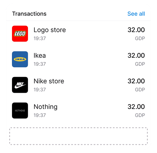
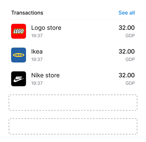
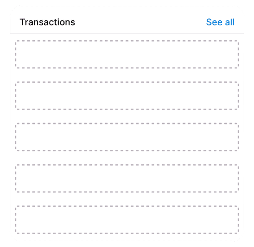
A key part of the system was the list component, which we knew would be used throughout the app. Designing a robust, slot-based list meant we could maintain visual consistency—even as the team grew or new features were added—while still allowing for flexible content and easy expansion. This approach made the list component incredibly versatile, working everywhere from transaction histories to settings menus, and helped keep the UI cohesive across the whole platform.
A key part of the system was the list component, which we knew would be used throughout the app. Designing a robust, slot-based list meant we could maintain visual consistency—even as the team grew or new features were added—while still allowing for flexible content and easy expansion. This approach made the list component incredibly versatile, working everywhere from transaction histories to settings menus, and helped keep the UI cohesive across the whole platform.
A key part of the system was the list component, which we knew would be used throughout the app. Designing a robust, slot-based list meant we could maintain visual consistency—even as the team grew or new features were added—while still allowing for flexible content and easy expansion. This approach made the list component incredibly versatile, working everywhere from transaction histories to settings menus, and helped keep the UI cohesive across the whole platform.


Image of list component
Image of list component
Image of list component
With the list component in place, we turned our attention to building out full screens and saw an opportunity to add another layer of theming with a surface component. This led to the creation of a surface card—a flexible container designed to hold the list component or any other content, all using the same slot-based approach.
With the list component in place, we turned our attention to building out full screens and saw an opportunity to add another layer of theming with a surface component. This led to the creation of a surface card—a flexible container designed to hold the list component or any other content, all using the same slot-based approach.
With the list component in place, we turned our attention to building out full screens and saw an opportunity to add another layer of theming with a surface component. This led to the creation of a surface card—a flexible container designed to hold the list component or any other content, all using the same slot-based approach.


Surface card with slots, slots changing to lists then add phone and other compoents above and below, then shape changing
Surface card with slots, slots changing to lists then add phone and other compoents above and below, then shape changing
Surface card with slots, slots changing to lists then add phone and other compoents above and below, then shape changing
The card could be themed independently from the base components, offering a wide range of variations in look and feel even before touching the color palette. This gave us nearly endless flexibility for customization across different client needs.
The card could be themed independently from the base components, offering a wide range of variations in look and feel even before touching the color palette. This gave us nearly endless flexibility for customization across different client needs.
The card could be themed independently from the base components, offering a wide range of variations in look and feel even before touching the color palette. This gave us nearly endless flexibility for customization across different client needs.


Surface card with slots, slots changing to lists then add phone and other compoents above and below, then shape changing
Surface card with slots, slots changing to lists then add phone and other compoents above and below, then shape changing
Surface card with slots, slots changing to lists then add phone and other compoents above and below, then shape changing


In some cases some of the UI was set solid until feedback would arrive from either the client or their customers for the need of a change. This thinking was set for the display of bank card information, but to help give banks a real feel of customisation the cards where built using the slot system so that the look of the card could be changed endlessly
In some cases some of the UI was set solid until feedback would arrive from either the client or their customers for the need of a change. This thinking was set for the display of bank card information, but to help give banks a real feel of customisation the cards where built using the slot system so that the look of the card could be changed endlessly
In some cases some of the UI was set solid until feedback would arrive from either the client or their customers for the need of a change. This thinking was set for the display of bank card information, but to help give banks a real feel of customisation the cards where built using the slot system so that the look of the card could be changed endlessly


background
image slot
details
freeze
highlight
background
image slot
details
freeze
highlight
background
image slot
details
freeze
highlight
The card is built up of five layers, the background is interchangeble with a swatch, and for more customisation the slot can be turned on and an image placed in place.
The card is built up of five layers, the background is interchangeble with a swatch, and for more customisation the slot can be turned on and an image placed in place.
The card is built up of five layers, the background is interchangeble with a swatch, and for more customisation the slot can be turned on and an image placed in place.

Example designs. By using the slot component for a background image anything is possible.
Example designs. By using the slot component for a background image anything is possible.
Example designs. By using the slot component for a background image anything is possible.
For icons, we used the Huge Icons set, and I set up a simple toggle in the variables panel so we could instantly switch between standard, fully rounded, or sharp icon styles.
For icons, we used the Huge Icons set, and I set up a simple toggle in the variables panel so we could instantly switch between standard, fully rounded, or sharp icon styles.
For icons, we used the Huge Icons set, and I set up a simple toggle in the variables panel so we could instantly switch between standard, fully rounded, or sharp icon styles.

We used the “outline.standard” variant as the default icon style, while the Duo tone was brought in for larger cases or as imagery in UI cards. The Duo tone effect relied on a single color with a 25% opacity, which kept customisation simple and streamlined the workload.
We used the “outline.standard” variant as the default icon style, while the Duo tone was brought in for larger cases or as imagery in UI cards. The Duo tone effect relied on a single color with a 25% opacity, which kept customisation simple and streamlined the workload.
We used the “outline.standard” variant as the default icon style, while the Duo tone was brought in for larger cases or as imagery in UI cards. The Duo tone effect relied on a single color with a 25% opacity, which kept customisation simple and streamlined the workload.

Standard
Standard
Standard

Square
Square
Square

Rounded
Rounded
Rounded
The Icon variations are subtle and are seen as a very important step to help give customers a more customerisated zexperience taylord to their own brand.
The Icon variations are subtle and are seen as a very important step to help give customers a more customerisated zexperience taylord to their own brand.
The Icon variations are subtle and are seen as a very important step to help give customers a more customerisated zexperience taylord to their own brand.
Before I wrapped up, I also started building out some micro-animations, all set up to work with the same slot-based approach—making it super easy to add a little delight wherever we wanted.
Before I wrapped up, I also started building out some micro-animations, all set up to work with the same slot-based approach—making it super easy to add a little delight wherever we wanted.
Before I wrapped up, I also started building out some micro-animations, all set up to work with the same slot-based approach—making it super easy to add a little delight wherever we wanted.
Visual of these animations
Visual of these animations
Visual of these animations
To get buy-in from those first key clients (and prove the idea would actually fly), we started by prototyping one or two core features.
To get buy-in from those first key clients (and prove the idea would actually fly), we started by prototyping one or two core features.
To get buy-in from those first key clients (and prove the idea would actually fly), we started by prototyping one or two core features.
An example of the working prototype for showcase to clients
An example of the working prototype for showcase to clients
An example of the working prototype for showcase to clients
Impact
The prototypes were a hit—Staq signed up enough clients to move the product into full build. The design system proved its worth: onboarding new clients was fast, and adding new features didn’t mean reinventing the wheel. We ran a few tests building out files for new customers and found that, aside from a few tweaks to color tokens, the speed and flexibility were exactly what we’d hoped for. Ultimately, the system set Staq up to scale quickly and deliver a tailored experience for every client, without the usual growing pains.
We had tested building out files for new customers which worked well, I forsaw a few small teething problems with simplifying some of the colour tokens but overall the speed to create the file for a new client was as low as we had orginally hoped.
We had tested building out files for new customers which worked well, I forsaw a few small teething problems with simplifying some of the colour tokens but overall the speed to create the file for a new client was as low as we had orginally hoped.
We had tested building out files for new customers which worked well, I forsaw a few small teething problems with simplifying some of the colour tokens but overall the speed to create the file for a new client was as low as we had orginally hoped.