
Sawline – Streamlining Orders for Sawest Sawmill
2024 · Lead Product & UI/UX Design
If you'd like to know more please get in contact
Context
Sawline is a digital ordering tool built to clean up Sawest Sawmill’s paper chaos—fewer errors, captured delivery fees, and a smoother day for everyone. We moved fast without cutting corners: a simple brand refresh, a focused product, and a pragmatic design system that keeps things scalable.

Branding
We took cues from industrial control panels—bold shapes, clear hierarchy, functional colour—and modernised the typography to Inter (sans) with a supporting mono face. The result: a robust, no‑nonsense feel that reads cleanly on screens and feels at home on the shop floor.


Design system
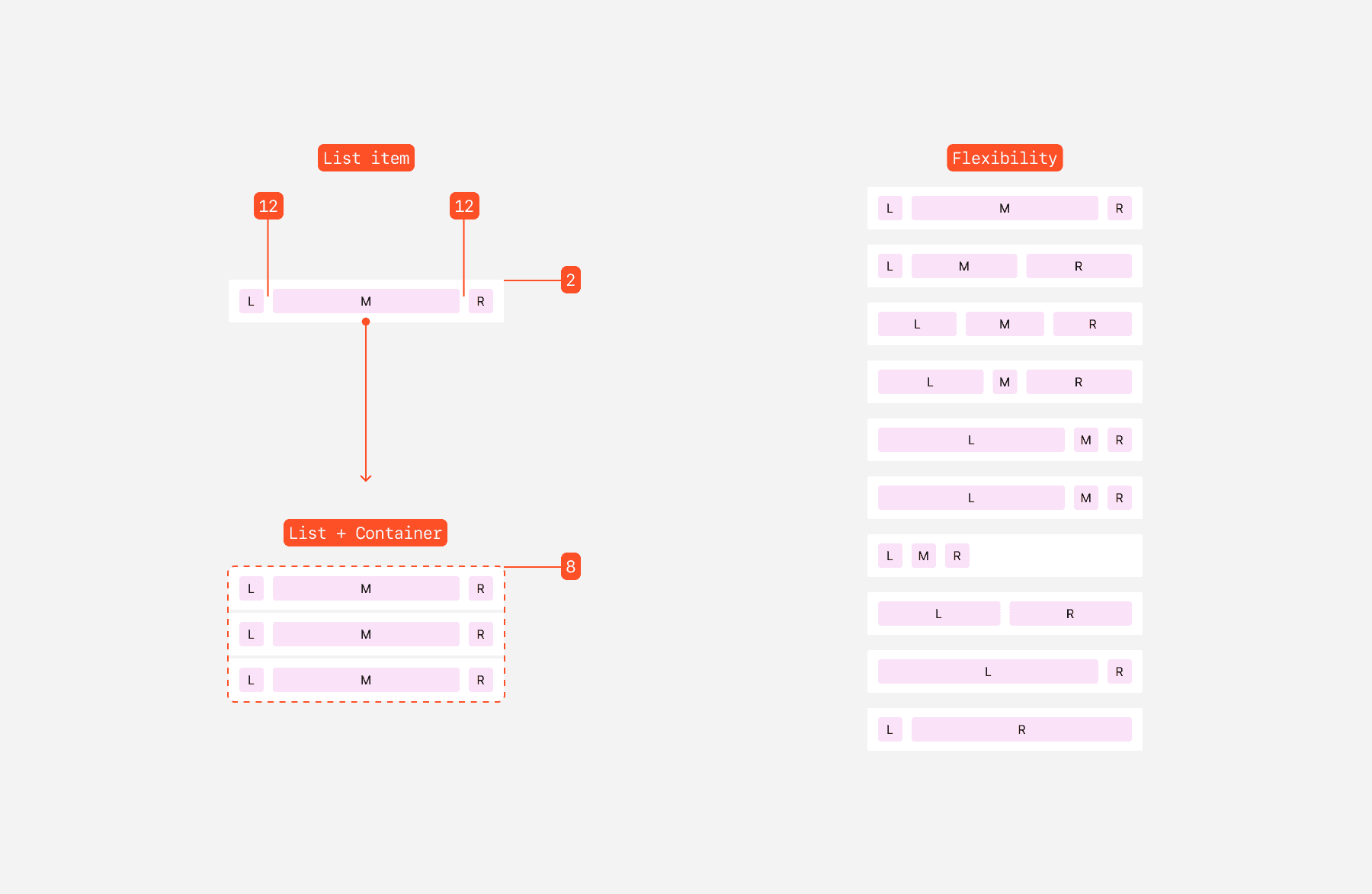
We used a component library design system (from MUI, called Joy) and themed it to fit Sawline. As all the components where built in React already it meant we could alocate more time to design and refinment then if everythign was built from scratch. To also help keep things stay lean and fast I built a list component using slots that was standardised and could be used in a number of different ways to stay flexible so new screens ship quickly and stay consistent, even scales neatly.
Colour scale
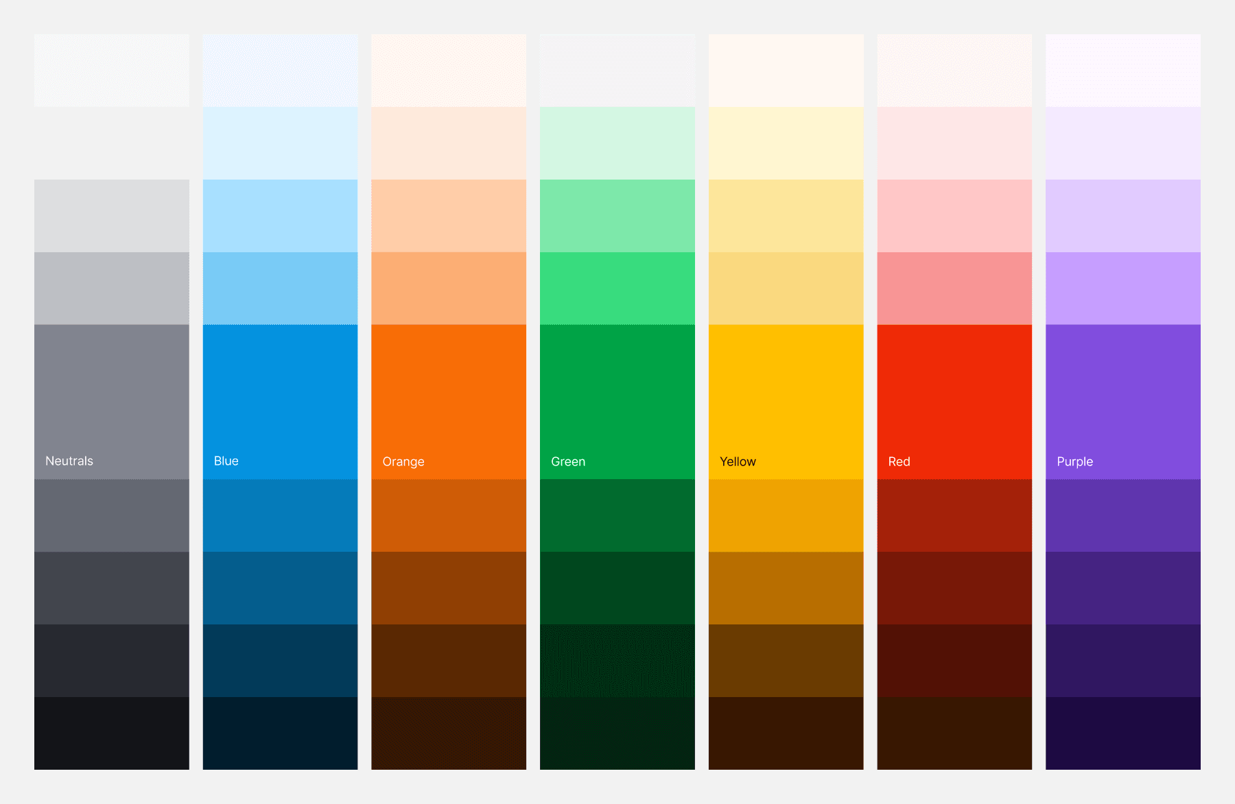
Colour token set


Icon set


MUI Joy Components
To support the use of the components I needed to create a flexible system that would help build consistency at speed and scale so that flows would easily be built with minimal risk of mistakes. Using a slot list component gave that speed and flexibility
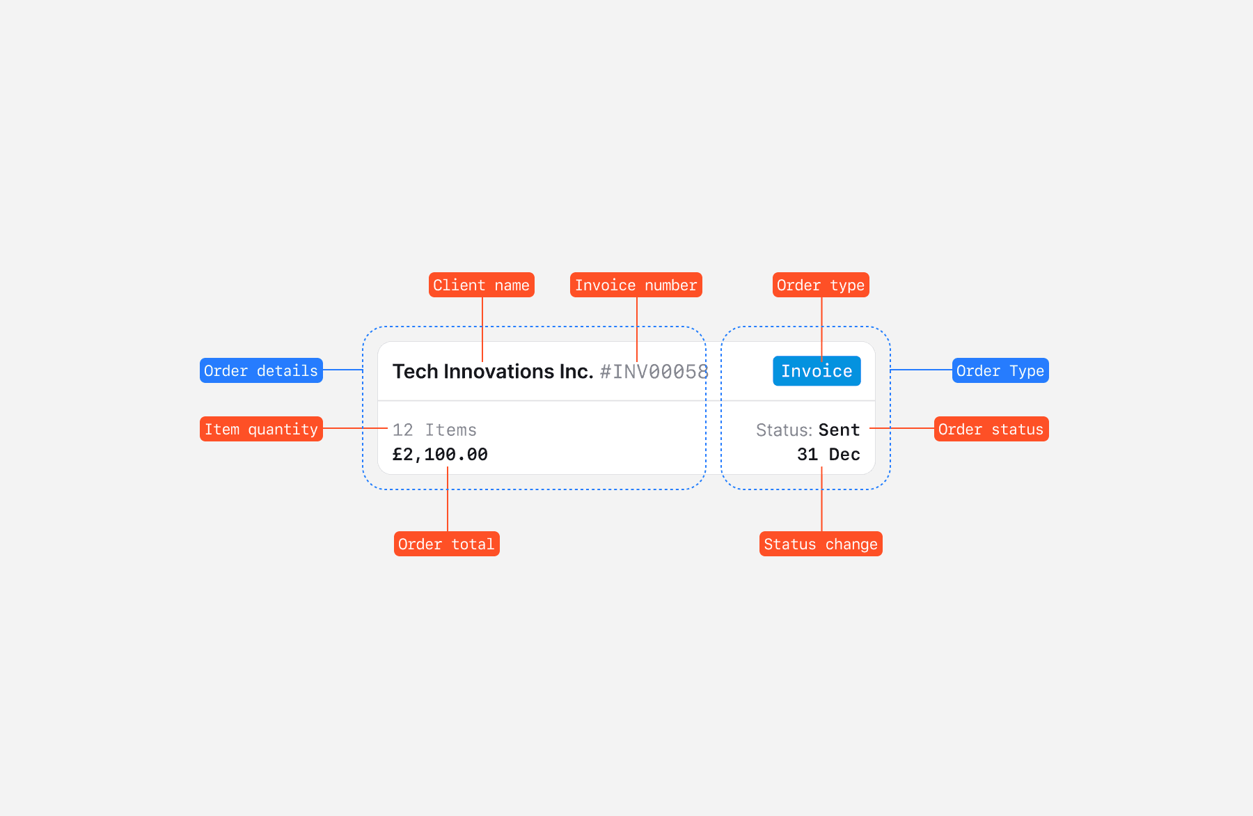
There is (of course) a sample of one off components that don't use the slot component as they required a little more complexity. This is an example of which is an order card
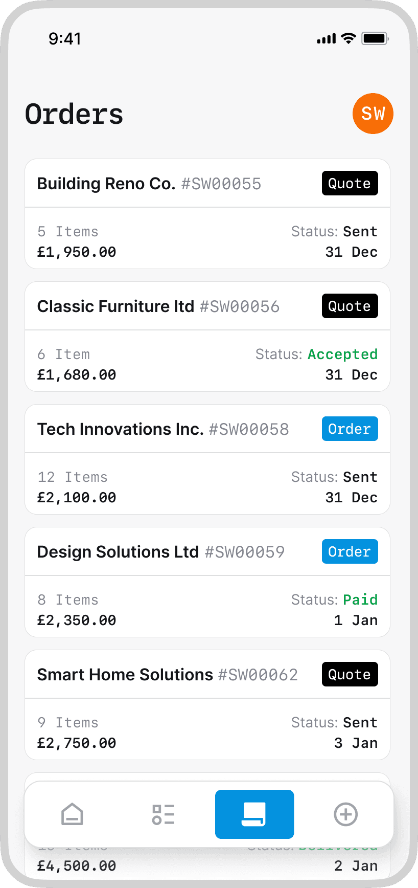
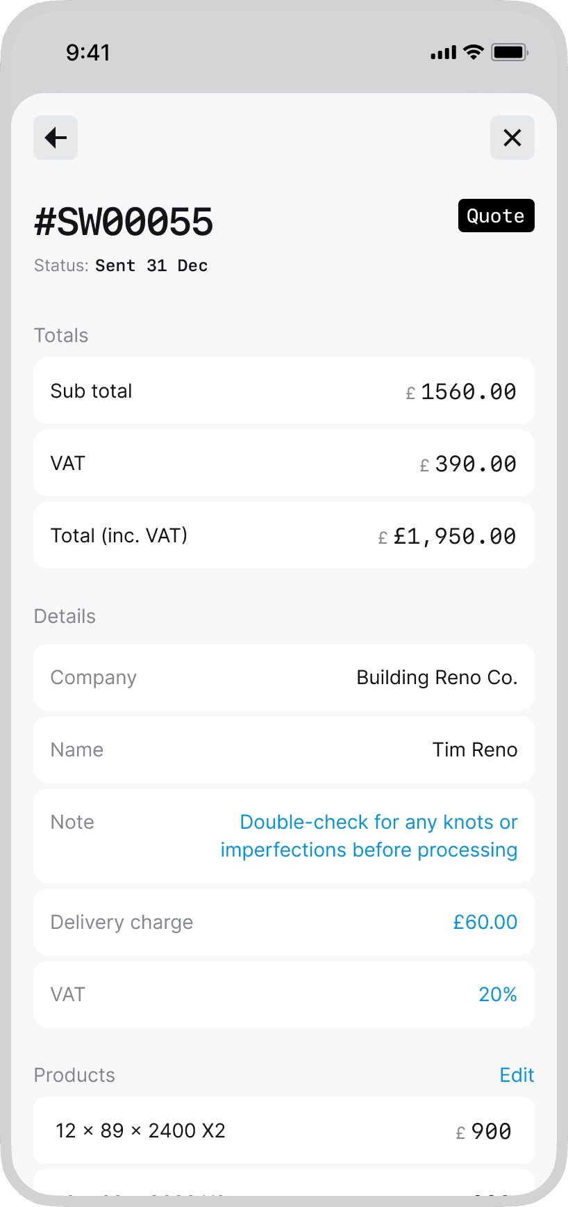
Product
Sawline standardises orders and makes the essentials unavoidable: required fields for delivery costs, consistent pricing, and customer details that stay in sync. Customer name inputs automatically search the database to avoid doubling up, pull up past orders instantly, and process new ones without second‑guessing. It’s fast, tidy, and built to reduce mistakes (by design). Also, we considered press states size and made elements slightly bigger in places as we found people are most likely wearing gloves when using the app.


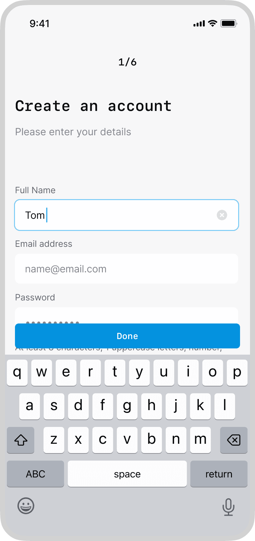
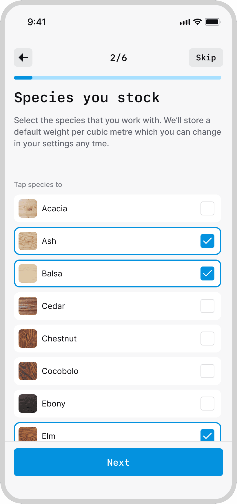
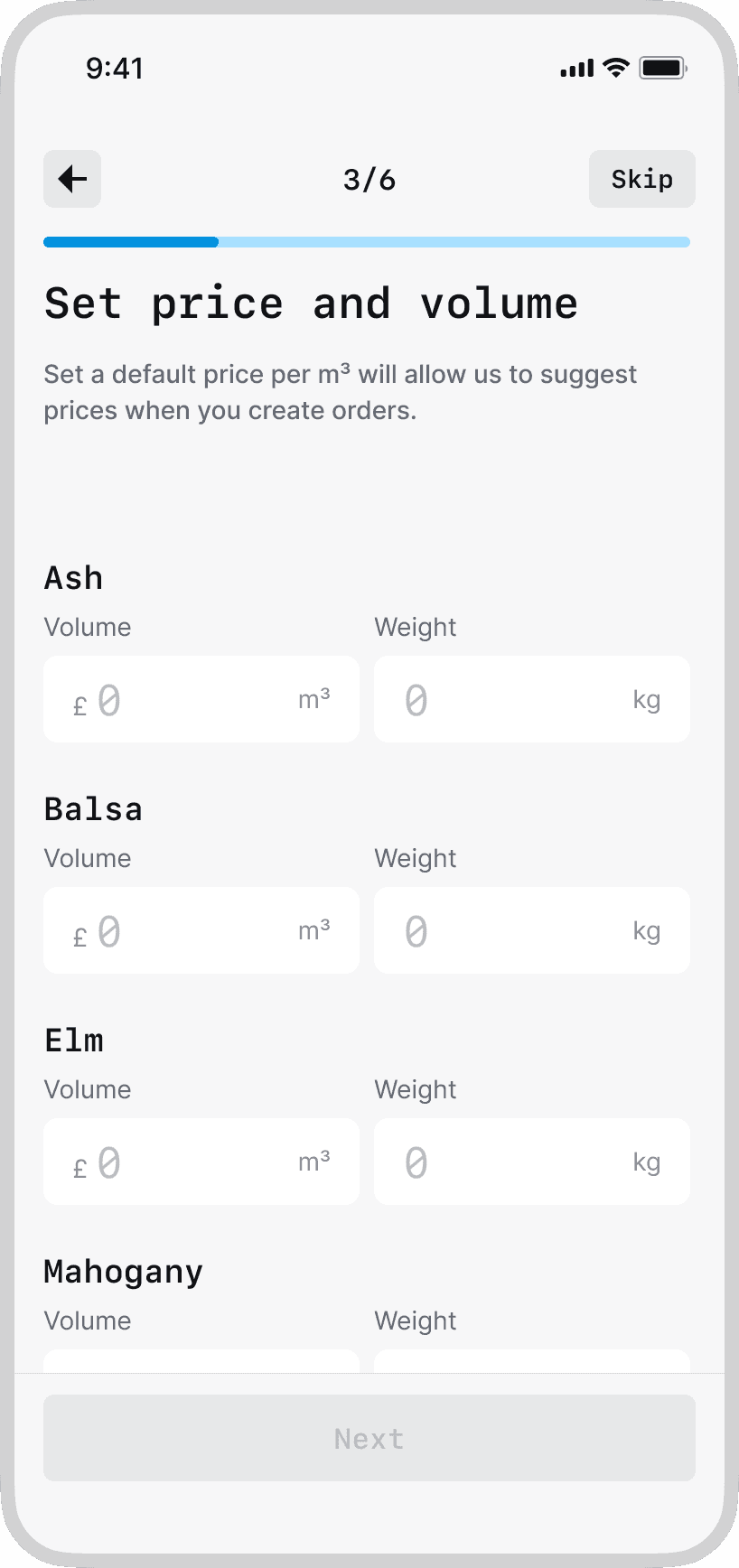
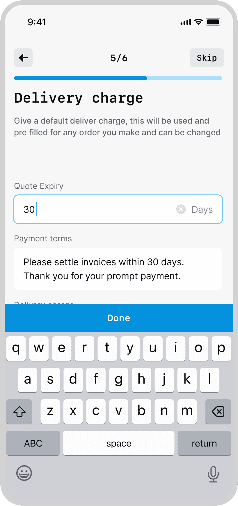
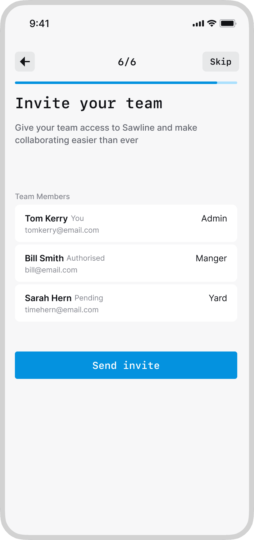
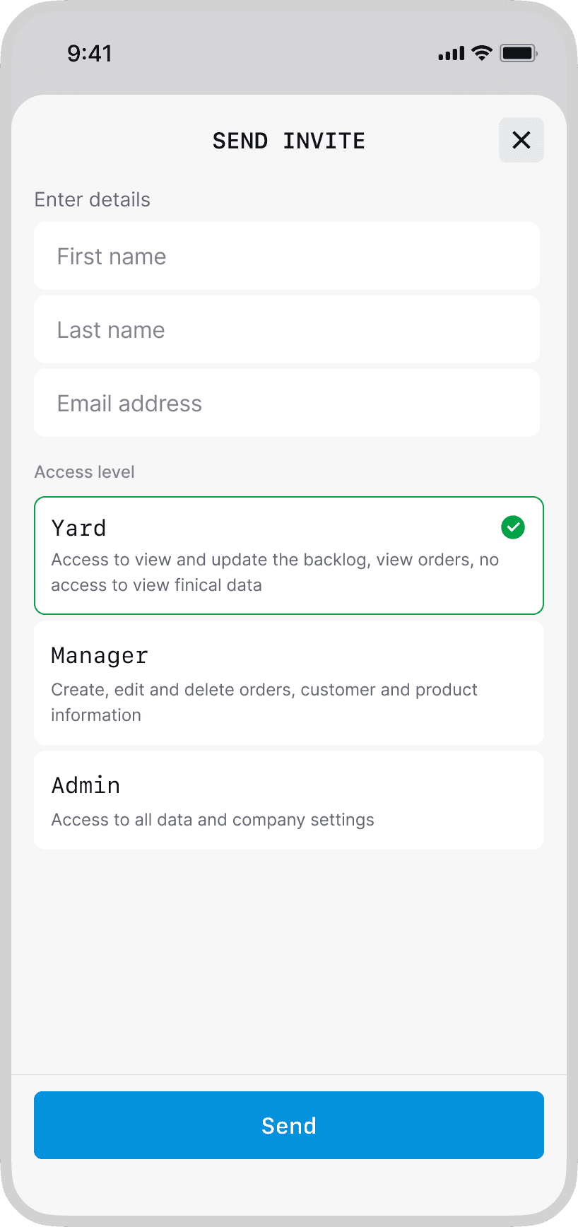
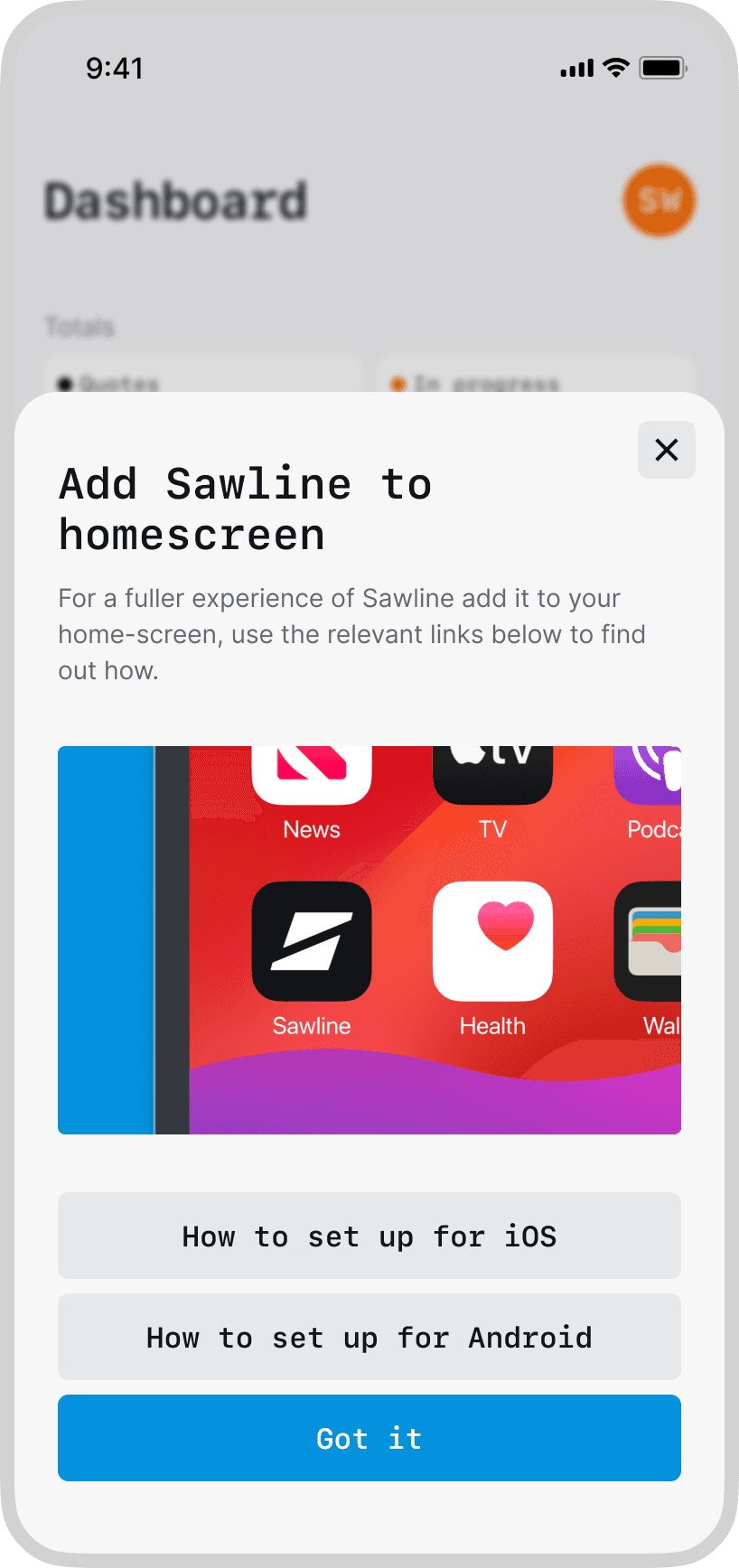
Onboarding
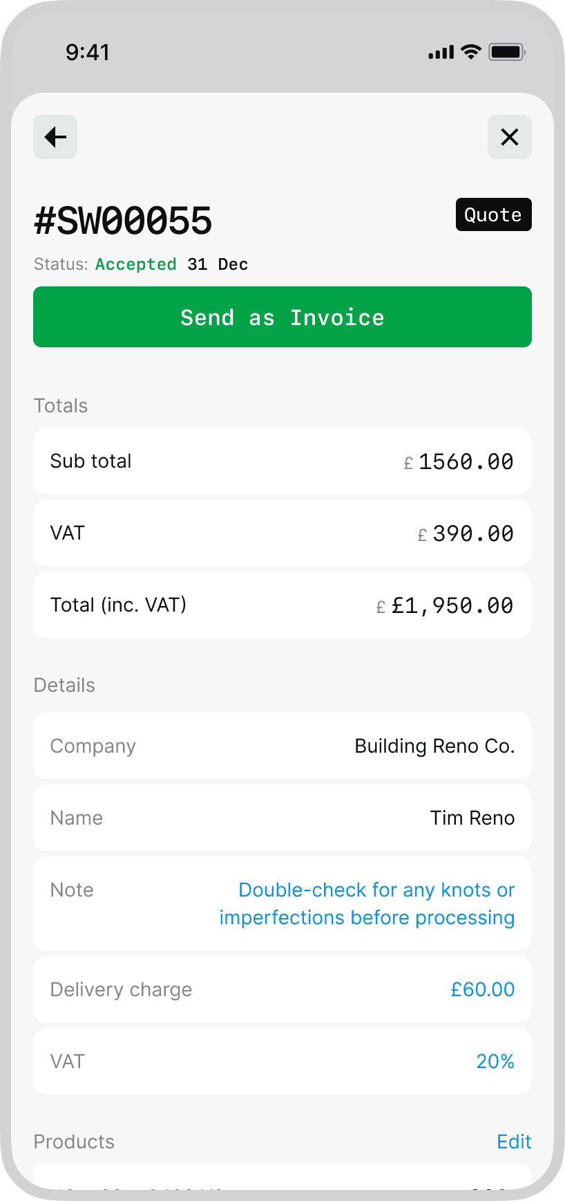
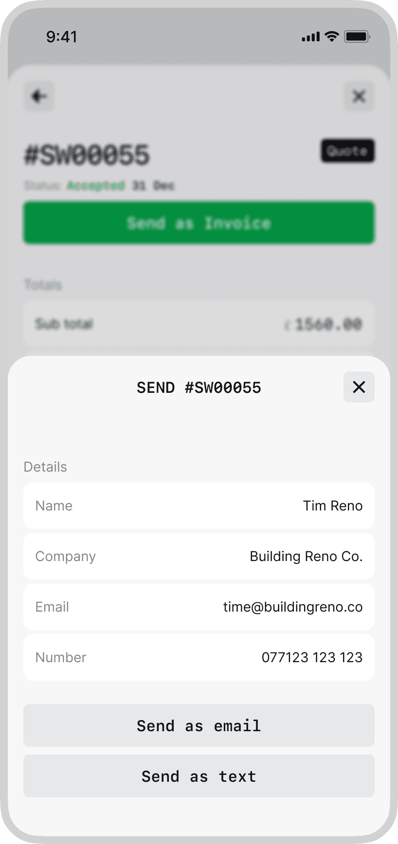
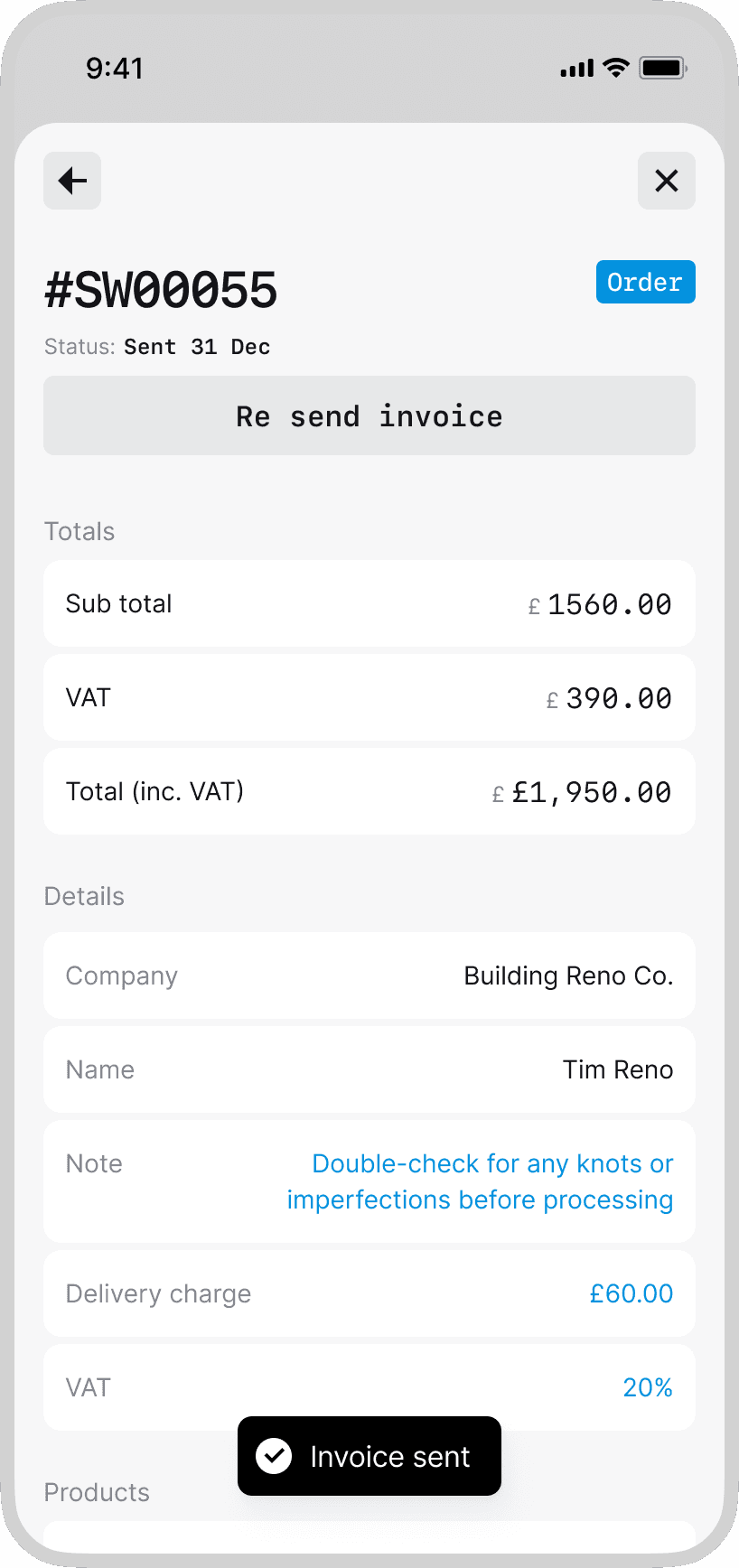
Sending invoice
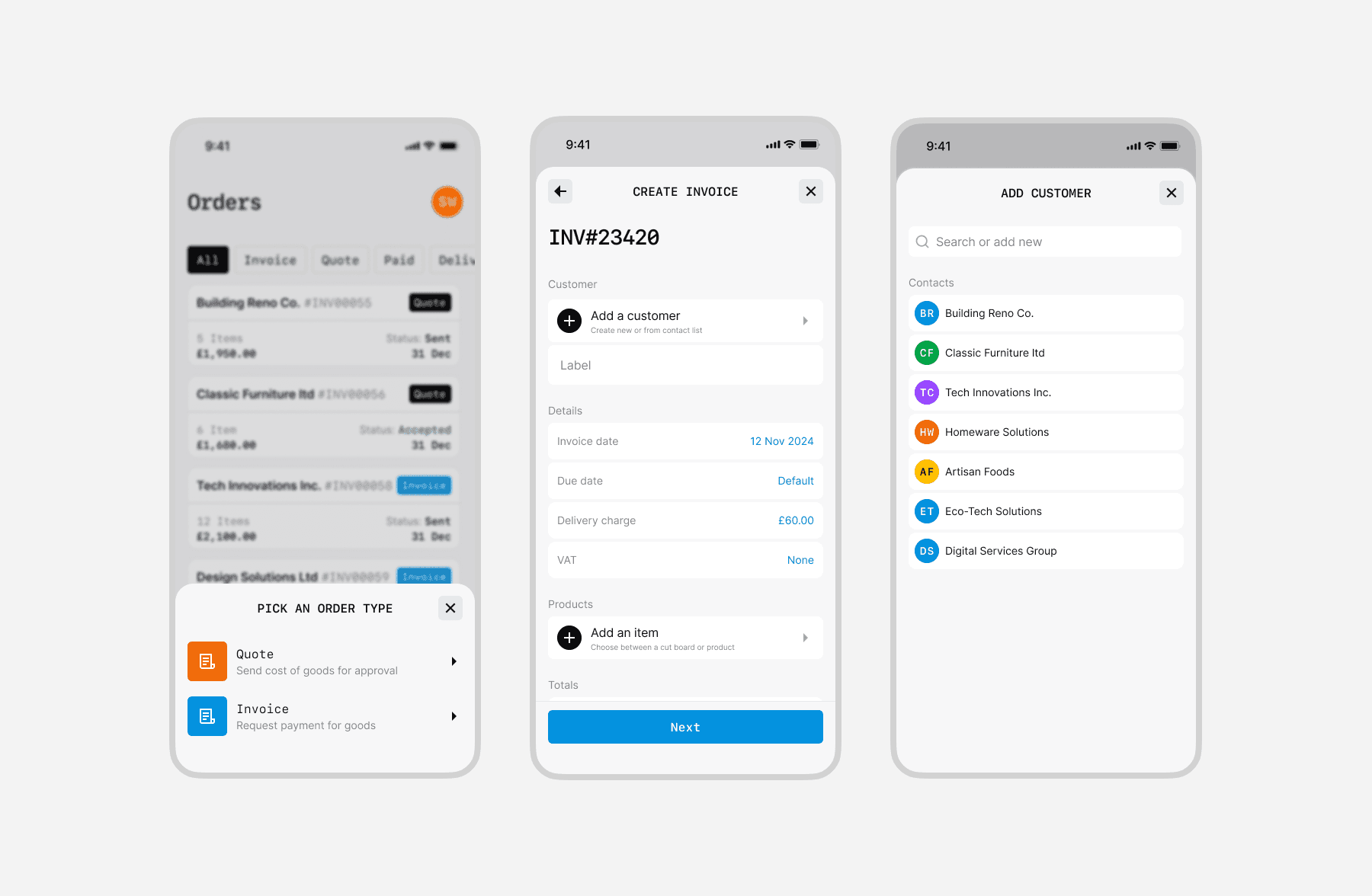
New order
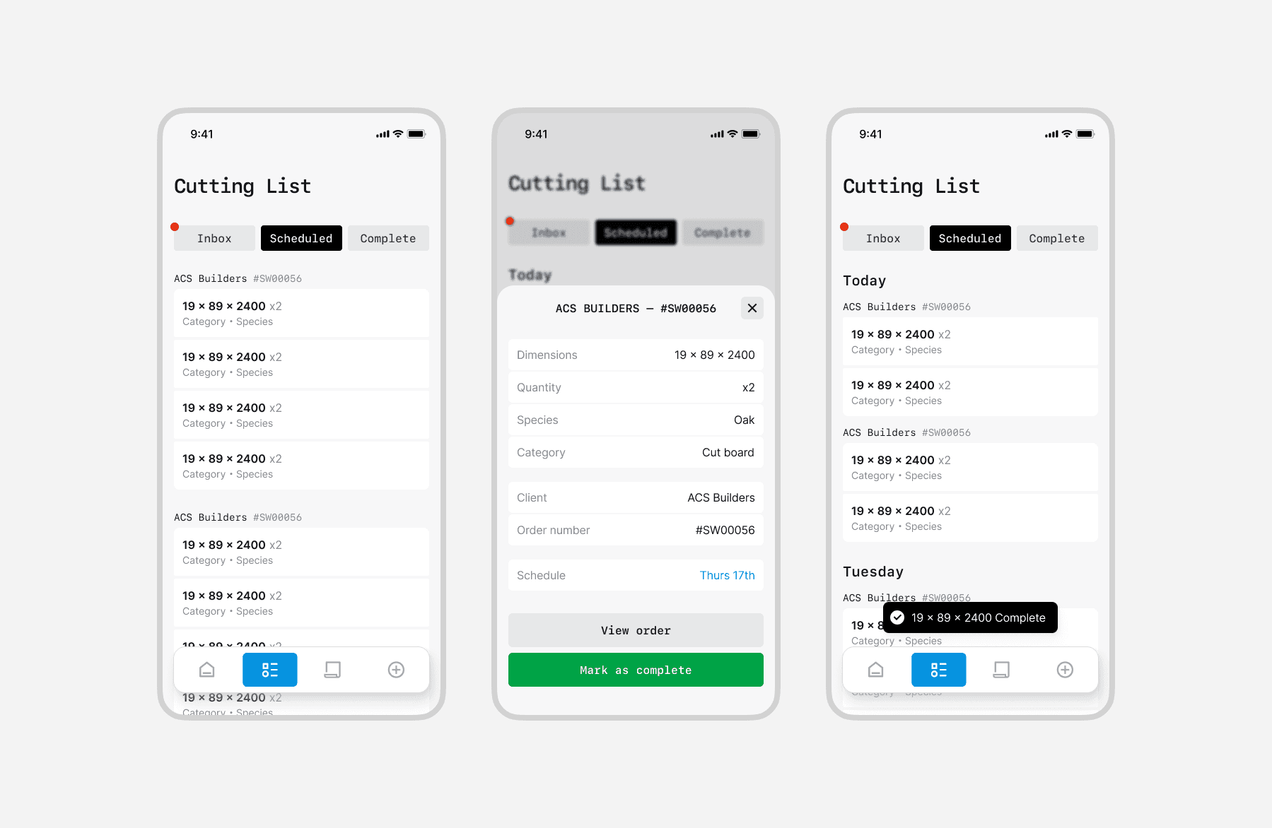
Mark item as complete
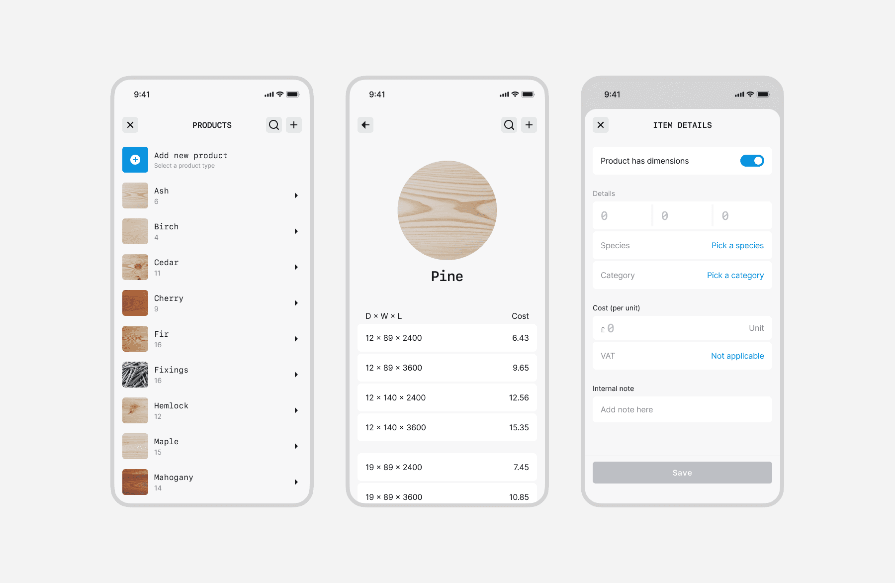
View product details
Reflection
This was a true startup sprint—fast, focused, and fun. I learned a lot about aligning design with business goals, shaping a simple go‑to‑market strategy, and shipping something scalable at high quality, quickly. The pace sharpened decision‑making; the constraints kept the work honest; and the result proved you can move fast without lowering the bar.
Next project


Staq – Whitelabel financal servies
Creating a modular banking app
Product / System


Winchester White
Elevating property search experience
Product


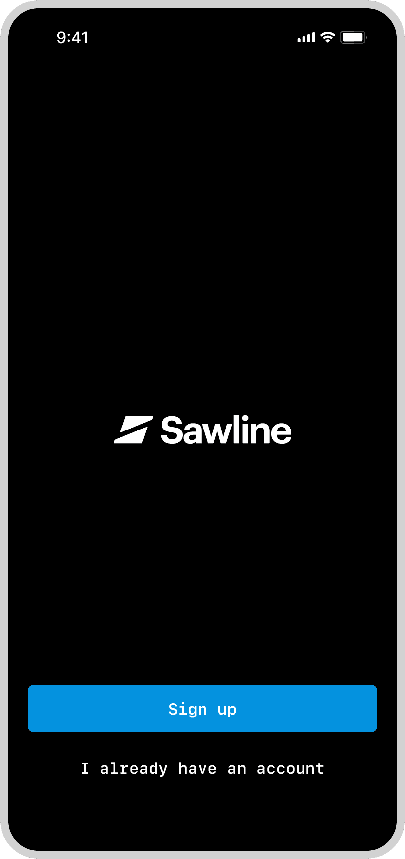
Sawline
Streamlining orders for sawmills
Product / System / Brand

MPA Publushing
A more vibrant space for music
Web design / Product


Studio MUTT
Clinical site rebuild
Web design (Framer)

Practice
Coming soon
Web design (Framer)